 ObjectExplorer
 Plot a binary file?
Click file, choose your chart.
A vendor sent us a file. It came in over email, as an export from their statistics package, and someone put it in a bucket. On Monday I had one question about it: how the rows split across a single category. I got the answer the following week, as a picture.
Today
The file was never going to reach the warehouse. Nobody builds a pipeline for a one-off vendor drop, and I wouldn't either. So the file sat in a bucket, and the console could show me its name and its size and offer to download it.
I couldn't open the format on my laptop. So I wrote a ticket. Someone who could picked it up a few days later, downloaded the file, loaded it in a notebook, grouped it, plotted it, and pasted the chart back into the ticket. The chart was right. It was also a week old, and when I had a second question it went back into the queue.
- Emailvendor sends a file
- Cloud consoleupload to a bucket
- Ticket queueask for a chart
- Notebooksomeone loads, plots
- Chata picture arrives
Nobody was slow. The analyst did the work in less time than the ticket waited. The console did what consoles do. The assumption every step shared was that a chart is something produced by a person with the right tools, rather than something you look at.
Ideal
So I tried to think about what a chart is. It is rows, drawn. A bar chart of counts per category is a group and a count, then one rectangle per group. There is nothing in that operation a laptop finds hard, even over a million rows.
The hard part is not the drawing. It is two other things. The first is reading the file, which means a reader for the format, so that a statistics export becomes rows and columns without its original program. The second is choosing which chart to draw, because a table with eleven columns has a lot of possible charts and most of them are useless.
The second is easier than it sounds. To show a table, something has already measured each column: which one is a date, which is a category with a handful of values, which is a measurement, and which is just an id counting up once per row. From those four answers the sensible charts follow. A measure over a date is a line. A count per category is a bar. A single measure is a histogram. Two measures are a scatter.
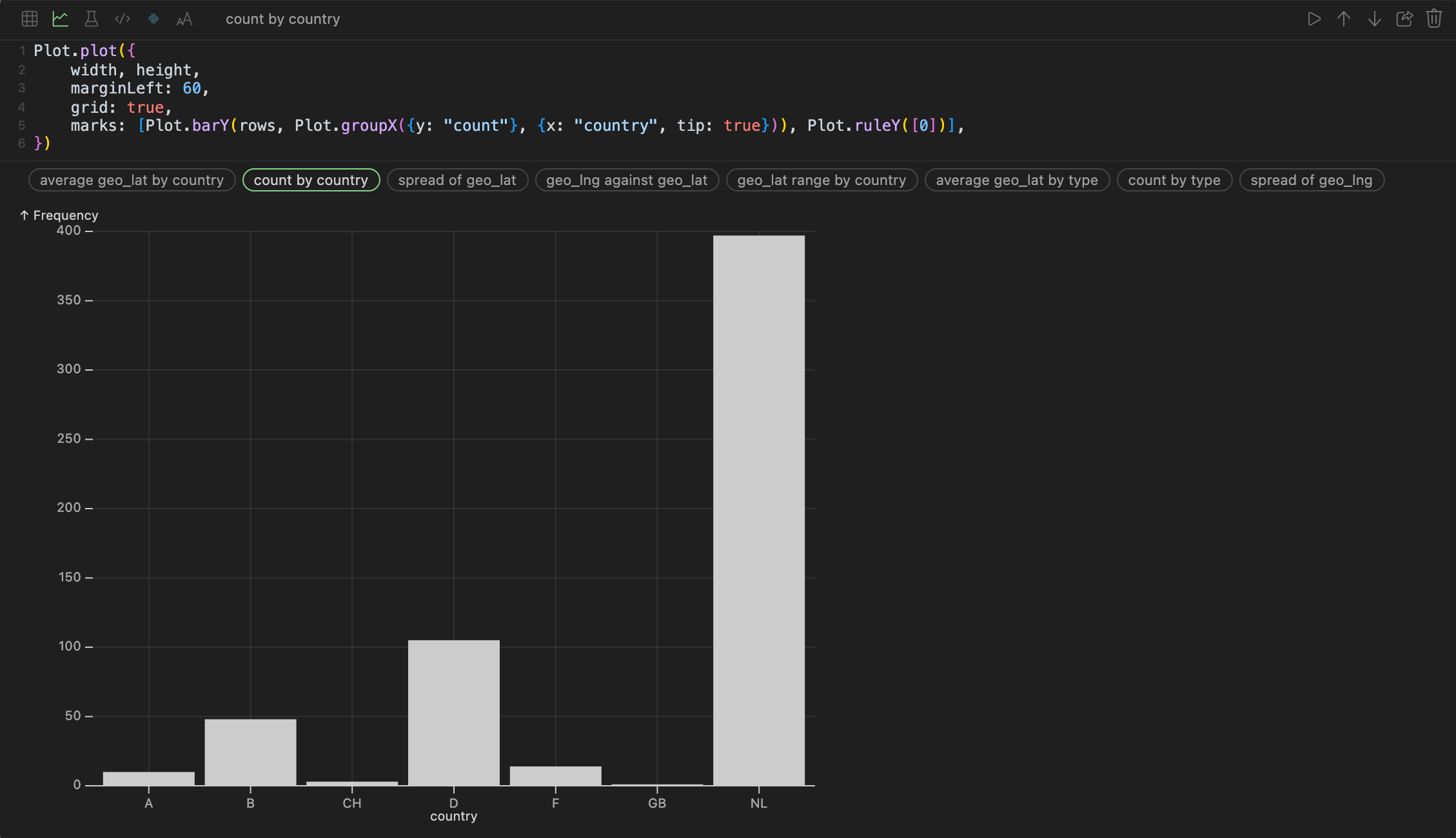
That is the train stations table with its charts offered as a strip of names. In the code, the strip holds at most eight choices. A category only qualifies if it has more than one value and no more than thirty, because past that a category axis is a wall of labels. A column of consecutive whole numbers, one per row, is recognised as a row number and never offered. And every choice is printed as source I can edit, not a picture I can only look at.
Where it stops
A format needs a reader. Statistics exports from SPSS and SAS, parquet, csv, json and spreadsheets can be queried, and Avro only when the app runs with its server rather than purely in the browser. A format outside that list is still a ticket.
And the suggestions are only suggestions. They know what a column is, not what I am asking. For the first question they are usually close. For the second I edit the source.
Click file, choose your chart.